THE ASK · DOORKNOCK · FIELD-OPS APP

50% navigation satisfaction with three screens instead of twelve.

50% navigation satisfaction with three screens instead of twelve.

50% navigation satisfaction with three screens instead of twelve.

Replace a spreadsheet-based workflow with a navigation structure real estate agents could actually use one-handed, in the field. My role: sole product designer for Doorknock’s real estate field-ops app.

Replace a spreadsheet-based workflow with a navigation structure real estate agents could actually use one-handed, in the field. My role: sole product designer for Doorknock’s real estate field-ops app.

Replace a spreadsheet-based workflow with a navigation structure real estate agents could actually use one-handed, in the field. My role: sole product designer for Doorknock’s real estate field-ops app.

What this case study showcases:

01 · I can spot when a product structure is technically complete but unusable in context.

02 · I can simplify IA around real user jobs without losing the business model.

03 · I bring frontline judgement from high-pressure service environments into product design.

50%

increase in agent satisfaction with navigation, measured in usability sessions.

Context

The ask: replace a spreadsheet workflow with field-ready navigation.

Doorknock’s agents needed to check status, plan routes, and manage credits while walking streets. The navigation had to work one-handed, outdoors, and under time pressure — not just look organised in a spec.

Problem

The first draft branched into a new screen for nearly every action.

In review, one tester asked, “Wait, where do I even start?” before doing anything else in the flow. That was the signal: the structure wasn’t helping agents begin, decide, or move.

What I did

I rebuilt the IA around three real jobs agents needed to do fast.

I rebuilt the IA around three real jobs agents needed to do fast.

I rebuilt the IA around three real jobs agents needed to do fast.

01

Check status

02

Plan a route

03

Manage credits

Evidence
From twelve branching paths to three navigational pillars.

From twelve branching paths to three navigational pillars.

From twelve branching paths to three navigational pillars.

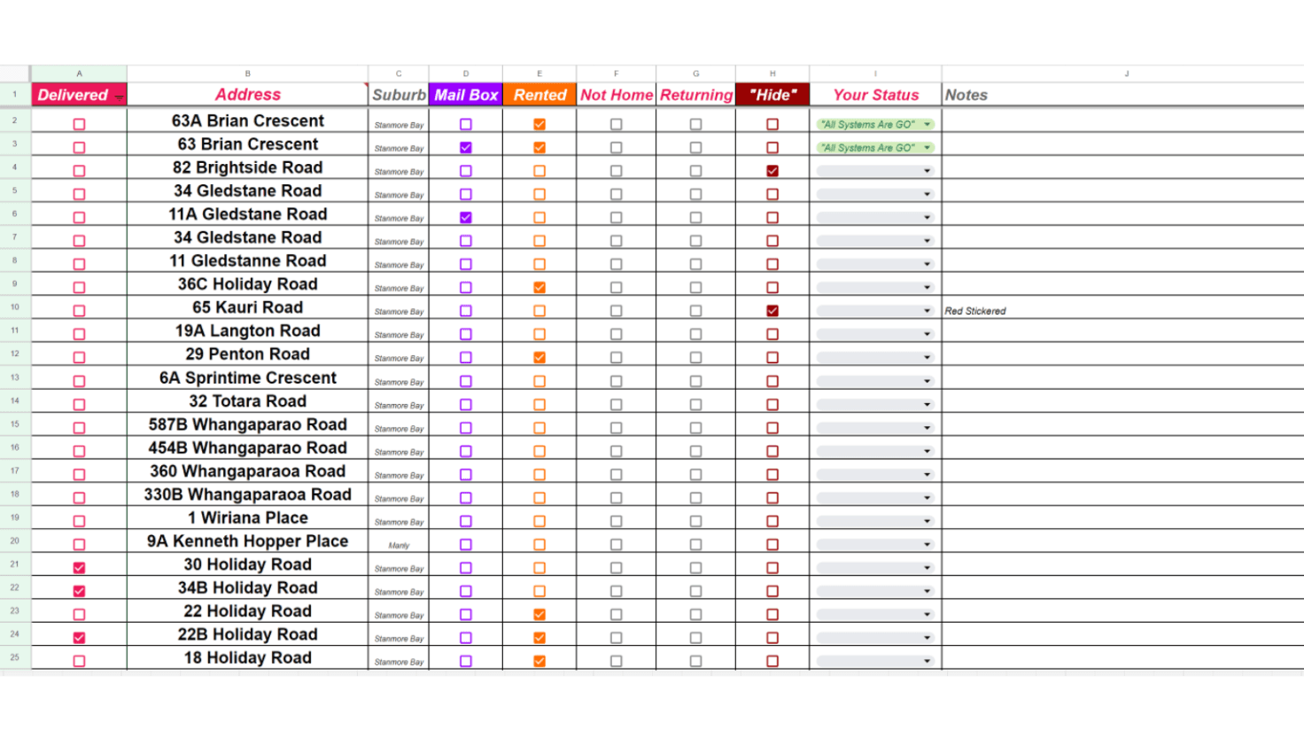
Original spreadsheet workflow used before Doorknock mobile app

BEFORE · branching screens made agents ask where to start

BEFORE · branching screens made agents ask where to start

Doorknock mobile app screens after navigation redesign

AFTER · Task, Account, and Area gave every screen a clear home

AFTER · Task, Account, and Area gave every screen a clear home

Updated supporting after screenshot for the Doorknock navigation case study

AFTER · supporting navigation detail from the redesigned Doorknock flow

AFTER · supporting navigation detail from the redesigned Doorknock flow

The navigation decision

Task. Account. Area. Every screen had to justify its place.

Task. Account. Area. Every screen had to justify its place.

Task. Account. Area. Every screen had to justify its place.

I sat down with the founder and asked three questions: what is the business trying to do, who are the users, and what actually needs designing. The answers pointed to three jobs agents needed to do fast: check status, plan a route, and manage credits. Every screen had to sit under Task, Account, or Area — or it got cut.

I sat down with the founder and asked three questions: what is the business trying to do, who are the users, and what actually needs designing. The answers pointed to three jobs agents needed to do fast: check status, plan a route, and manage credits. Every screen had to sit under Task, Account, or Area — or it got cut.

Task

Task

Check status and know what needs action now.

Check status and know what needs action now.

Account

Account

Understand credits, limits, and account state.

Understand credits, limits, and account state.

Area

Area

Plan routes and work through properties in the field.

Plan routes and work through properties in the field.

50%

50%

50%

increase in agent satisfaction with navigation.

increase in agent satisfaction with navigation.

increase in agent satisfaction with navigation.

Measured in usability sessions comparing the original branching structure against the three-pillar version with the same participants.

Why I noticed this

I’ve seen what systems feel like under time pressure.

I’ve seen what systems feel like under time pressure.

I’ve seen what systems feel like under time pressure.

Eight years in frontline case management meant sitting across from people trying to navigate a system while stressed, rushed, or uncertain — and watching exactly where they got stuck. The same read applied to an agent standing on a doorstep trying to find one screen.

For hiring managers

Curious how I’d approach a similar flow on your product?

Curious how I’d approach a similar flow on your product?

Curious how I’d approach a similar flow on your product?

This case shows the product-design judgment I’d bring to your team: simplify the structure, preserve what the business needs, and design for the moment the user is actually in.

This case shows the product-design judgment I’d bring to your team: simplify the structure, preserve what the business needs, and design for the moment the user is actually in.

Product thinking

I reduced a branching IA into a system agents could remember and use.

UX/CX judgement

I designed for one-handed field use, not just a tidy screen review.

Team maturity

My frontline background helps me notice where people freeze before the interface does.